What makes an excellent architecture firm website?
A lot of people believe the answer to this question is “design.”
After all, architects design beautiful buildings. It only makes sense that showing off their style is the primary purpose of their website, right?
Wrong.
You see, while good design is essential, SEO and UX are FAR more critical than the looks of your website.
In this article, we’re going to explore these factors.
We’ll take a look at some of the very best architecture firm websites and give you some cold hard facts on what they’re doing right.
And by the end of it?
You’ll know everything you should do to build your very own website.
Let’s dive in.
Before diving into the best architecture firm websites, let’s look at what makes them great first.
You can have a spectacular and unique architectural website…
…one that is more beautiful than any other…
…one that lets your style shine through…
…and STILL, your website would be terrible.
Why?
Because websites are not all about design.
UX, or user experience, is a LOT more important than the looks of your website.
An excellent architecture firm website must have these six pages that people are looking for:
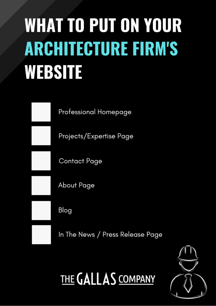
If you have several locations, you may also want to throw in a “locations” page.
But here’s the catch:
It has to be SUPER easy for your visitors to find these pages.
Why?
Because if your audience can’t find what they’re looking for right away, they’re going to click that back button.
Take Bjark Ingels Group’s homepage as an example.
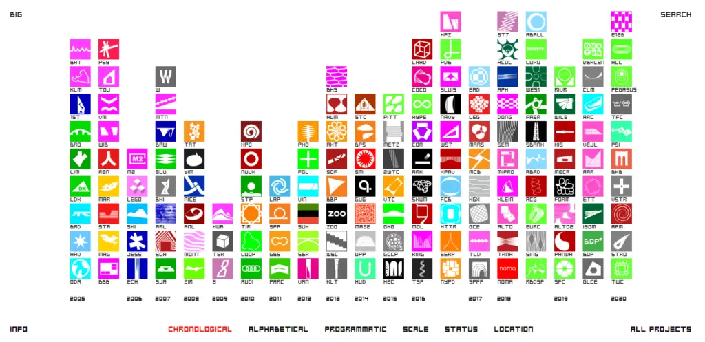
This website has one of the most fun and unique designs around.
However, it isn’t easy to use in any way. Plus, for people with slow internet, it can take a while to load.
Sure, a giant company like Bjark Ingels can get away with this (and they more than makeup for it with everything else they have on their site).
But if you were to follow their design, don’t expect your website to give you too much value.
Instead, your website should have a great design WITHOUT sacrificing user experience.
How?
We’ll take a look at a few examples in a bit.
But first…
How do you get people to visit your website?
Keywords.
When you rank in search engines for the right keywords, people will find you whenever they search for a term related to your business or topic online.
And one of the secrets to a successful architecture firm website is ranking for EVERY keyword in your niche.
No, you don’t have to rank #1 for every single keyword.
But if you can get into the top 100 for thousands of keywords, there’s a BIG chance you’ll get into the top 10 for hundreds of keywords (which is where traffic comes from).
Meanwhile, if you only rank for a dozen or so keywords, something is wrong.
Diehl Group, a forensic architecture firm based in California, has a very neatly-designed website.

It isn’t overly fancy, and you can easily find what you’re looking for.
And looking at their stats on an SEO audit, you’ll find that they have a decent domain rank and referring domains.
However, as of right now, they are ranking for far too few keywords.

They aren’t even ranking for the term “forensic architecture!”
And this is a problem.
A big problem.
The only way people will find this website is to type “Diehl Group” or the architect’s name in their search engines.
That is why when you are building up your website; you NEED content.
So go after every keyword related to your firm or specialty.
Remember, you don’t have to win them all.
But if you’re going to grab a few big wins (keywords that you would LOVE to rank #1 for), you’ll need to rank for thousands of smaller keywords to back it up.
If there’s one thing every excellent architecture website has in common, it’s this:
They all have great SEO.
Now, the examples of architecture firm websites we’re about to show you are all giant firms.
These are firms that have full advertising teams and spend boatloads of money on building an online presence.
But the funny part?
You don’t need these to rank well.
With SEO, you can take on these giants without spending nearly as much as they do.
We covered how to do this in-depth in our ultimate guide to architecture SEO, so check it out.
But without any further ado, let’s take a look at the best architecture firm websites (and what makes them so great!)
As said before, two things separate architecture websites from excellent architecture websites.
These are SEO and UX.
If you scan the websites of the most prominent architecture companies in the world, you’ll realize that ALL of them do these two exceptionally well.
Let’s have a closer look.

Who said functional websites have to look boring?
Foster and Partners, whose homepage currently features a slideshow with videos, shows you otherwise.
And despite the beautiful homepage, it’s still effortless to find what you’re looking for, thanks to the navigation bar on the top right.
But more importantly, Foster and Partners’ website is packed with information.
Not only do they write on all their projects and expertise, but they also write blog posts.

And the best part?
These articles go super in-depth while still being super easy-to-read for everyone.
All of this and the reputation of this firm have earned them a solid SEO score.

Foster and Partners’ website is doing exceptionally well with a DR (domain rank) of 76 and 49k organic keywords.
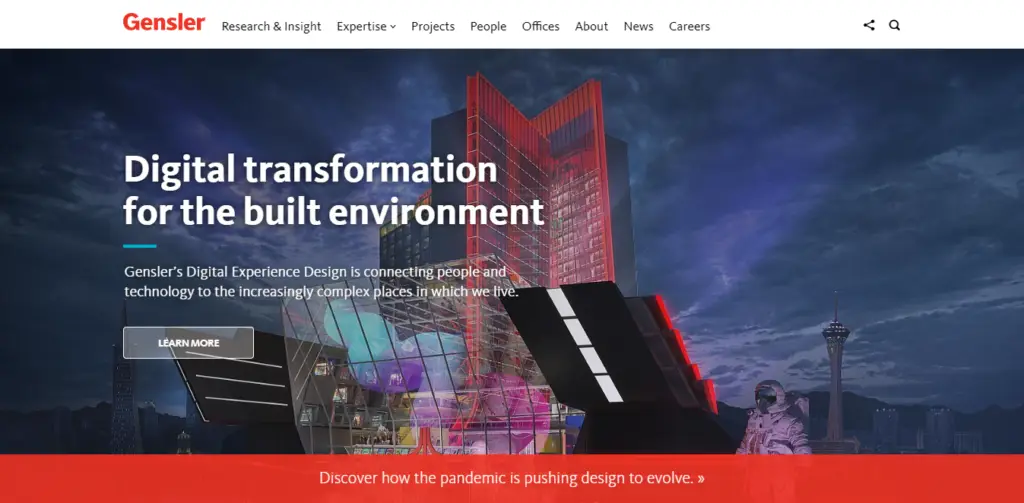
Talk about simplicity, Gensler’s website has one of the most straightforward architecture website designs around.
No gimmicks, no fancy designs, Gensler just gets straight to what their visitors are looking for.
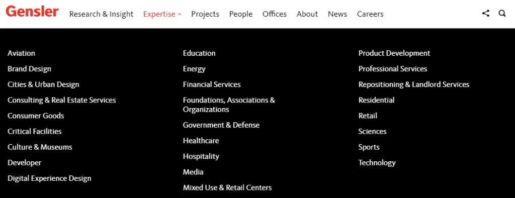
One tip you can take away from Gensler is that in their “expertise” pages, they sprinkle project, blog, and media articles related to that expertise in there.
Take their aviation page as an example:

Not only do they provide a quick overview of what they do, but they also link some of their projects, media articles, and blog posts about aviation here.
And they do this with every expertise they have, which is a lot.
No wonder they’re ranking for around 100k keywords!

So when you’re building your architecture firm website, Gensler is easily one of the best examples you should follow.

Speaking of ranking for keywords, Stantec is at the top of the ladder.
Right now, they’re ranking for an outstanding 162k organic keywords.
162k!

And no wonder!
Stantec’s website is jam-packed with content.
They are ranking for just about every single keyword related to their firm – from their brand name to super-specific industry keywords (such as “how long is an airport runway?”).

In the online world, Stantec is completely dominating.
However, if there’s one problem, it’s that Stantec’s site isn’t particularly easy to use.
It leans ever so slightly into the fancy side of things.
Yes, it’s far better than some other architecture sites. But it’s not something, say, your grandma can use.
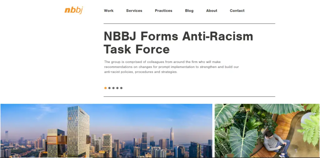
Are you looking for another elegant architecture website?
Check out NBBJ.
There isn’t much on the homepage, but it’s already complete.
There is a navigation menu, some news headlines, and if you scroll a little lower, you’ll meet these beautiful cards of the projects they’ve done.

All of which you can click to read more about them.
They aren’t doing poorly in keywords either, with their website ranking for around 20k terms.

That said, one flaw of NBBJ’s website is not having a blog.
Yes, they do have a blog tab. But all you’ll find there is a link to another website where NBBJ publishes their content.
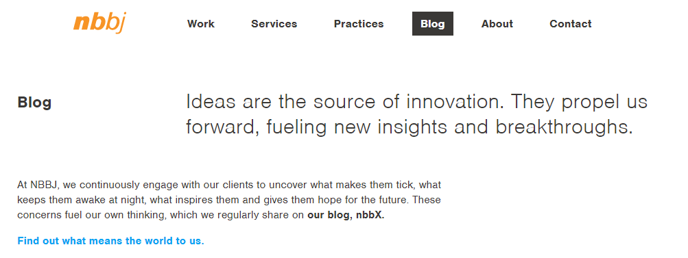
In the SEO world, this is a big no-no.
Why have two separate websites when you can focus on growing one?
As you can expect, their blog website isn’t doing too well – when it could have helped their main website grow even further and rank for more keywords.
So you see?
Even large corporations with huge marketing teams make mistakes.
You don’t need a monster budget to outrank these websites with SEO.
But other than the blog, NBBJ has a great website that is worth imitating.
For the last one, let’s see why some architecture firm websites are doing so well and why others aren’t.
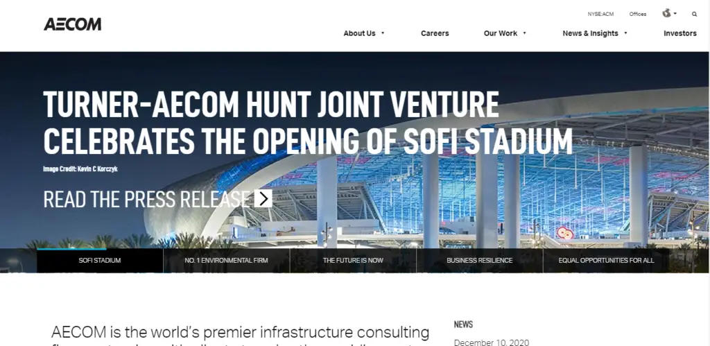
If you explore Aecom’s site, you’ll find it ticks all the boxes of a great architecture website.
It’s easy to use, it looks great, they have all the pages they need, and they’re ranking for hundreds of thousands of keywords.

Aecom is an enormous company, and they have a beast of a website.
However, compare their website stats to an equally gigantic firm, RSP Architects.

Aecom and RSP Architects are frequently together in “largest architecture firms in the world” lists.
In the online world, though?
Aecom blows RSP out of the water (at least, for now).
Yes, RSP’s Domain Rating of 51 and 4.1k organic keywords are great for most firms.
But compare those numbers to Aecom’s, which has a DR of 80 and is ranking 124k keywords – and you’ll find there is a vast difference.
For a company as large as RSP, something is sorely lacking.
What?
Head over to RSP’s website, and you’ll see why.

Yes, it looks beautiful.
But unlike Aecom, this site isn’t elementary to navigate.
And it’s also severely lacking in content (they don’t even have a blog).
Once again, it all goes back to those two critical things:
SEO and UX.
Because at the end of the day, those two things are what spell the difference between an architecture website and an excellent architecture website.
They’re what separate a mediocre site into a highly-valuable website for your firm.
By now, you should have a solid understanding of what truly makes an architecture firm website great.
However, we should warn you, building one is NOT easy.
You’re not only going to have to find the perfect balance between beauty and ease-of-use for your website, but you’re also going to have to go after thousands upon thousands of keywords.
You’re going to have to pour in hours of hard work just to get started.
But if you persist, if you keep on improving your website’s SEO day by day, you will eventually come to a point where your firm will be the authority of your niche.
Want the professionals to do all the hard SEO work for you? Find out how we can help you get your website to that #1 spot!