Get this:
Whether you’re building a new website or updating an old one, website design is one critical factor to consider.
Good web design is so vital that some companies spend thousands of dollars on it.
But if you’re wondering just how important it is – or whether or not you should invest in good web design – you’ve come to the right place.
Today, we’re talking all about the importance of website design for digital marketing.
We’re looking at the why, the what, and the how:
There’s a lot to cover, so let’s dive in!
First, the basics:
Everybody likes a good design.
Don’t you?
Doesn’t everybody you ever meet?
Professional designs are always more attractive than designs by toddlers.
However, that’s not the answer you came for, is it?
The real question is:
Why should you pour effort or money into creating a good website design?
What will you get from it?
Is it worth it?
The answer is yes. And here are four reasons why design is important:
We all know a first impression lasts.
If you meet someone wearing a pokemon onesie at a business convention, you’ll assume that person doesn’t take themselves very seriously.
And even if you get to know them and find out that they’re quite successful themselves – that wacky image will always be there.
It’ll be almost impossible for you to see them as professional.
The same is true for your business website.
If people see a poorly designed website, their first impression of you is going to be “Unprofessional.”
Trust us, that’s the LAST thing you want.
And here’s another thing:
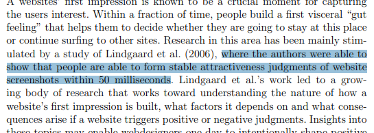
Google conducted a study on visuals and first impressions on websites, and they concluded that it takes all of 50 milliseconds for people to get an impression of your business website.
If people are appalled by your design, they’re going to click the back button immediately.
Who knows, they might even head to your competitor.
If you wanted to buy a used car, would you buy from:
Assuming they were offering the same model at the same price, everyone would pick number 1.
Why?
Because people trust people that look good and professional.
The same is true with websites.
You wouldn’t buy a laptop from a website that looks like it’s from 1999, would you?
Neither would you buy from a messy website that looks like it was thrown together by a kid.
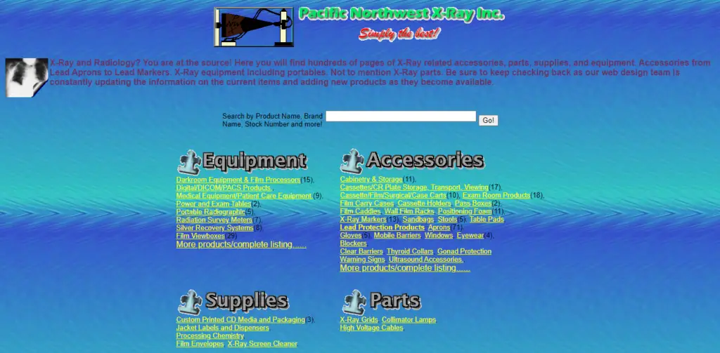
No, you’ll get a laptop from a website that is clean and professional.
One that you can tell the owners mean business.
That’s why if you’re telling people that you can solve their problems with your products, you NEED to build trust.
You NEED to look professional.
You NEED a good website design.
Have you noticed how we associate colors with brands?
Facebook is dark blue. Twitter is light blue.
Canon is red. Nikon is yellow.
These are some examples of successful branding.
And speaking of website design, this is a tremendous opportunity for you to do a little branding yourself.
Good web design uses a specific color scheme for your entire website to make people associate that color with your brand.
Not only that, but good web design also uses specific styles to set your brand.
For example, do you recognize this font? Particularly, the W?

If you guessed Wikipedia, you’d be right.
Good job!
As your online marketing efforts continue to grow and more traffic enters your site, consistent branding will build a familiarity with your audience.
And here’s the deal:
People trust familiar brands.
That’s why a well-designed website that builds up your brand is so important.
Who doesn’t?
Think about every website you frequent, and you’ll realize that its design is elegant.
If it wasn’t, you either wouldn’t be there, or you’ll get out as soon as possible.
Speaking of online marketing, keeping people on your page is critical. If your design turns people away, this will be detrimental to your efforts.
The longer people stay on your website, the better this will be for your website ranking. In turn, this will bring even more traffic to your business website.
Of course, good design doesn’t just mean what your business website looks like, but also how it works.
If your business website is super good-looking, but people can’t find what they’re looking for, people won’t enjoy it.
If you think you know what good web design looks like, think again.
You might think that good web design is all about looks.
If your business website has the right colors and the right visuals, then it’s perfect!
Right?
Wrong.
Good website design is so much more than just what your website looks like. It also has a LOT to do with how your website works.
UX, or user experience, is a critical part of web design.
Without good UX, your business website design will ultimately fail – no matter how beautiful it is.
So let’s see…
What exactly makes a good website design?
Let’s break it down for you.
We just said that the actual looks for your business website aren’t everything.
However, that’s not to say that they don’t amount to anything.
The actual design of your website plays a significant role in the branding of your business.
It’s also the colors and the theme that can show your professionalism and make a good first impression.
Now, it’s tough to say what an excellent actual design looks like.
Beauty is in the eye of the beholder, and everyone has their tastes.
Everybody has a brand that they want to show. And sometimes, it can get cartoonish.
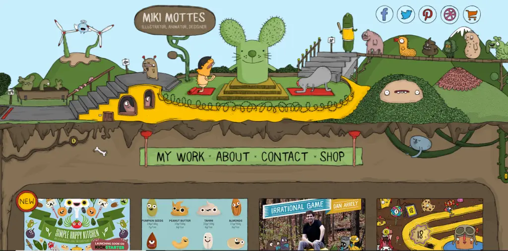
As long as your business website theme represents your brand well (and has good UX!), then there shouldn’t be any problems.
But here’s the thing:
Good looks support your website’s user experience, not the other way around.
Even in the highly decorative website above, you can see it’s still very easy for people to find what they’re looking for.
So as you build your business website, ALWAYS put UX above design.
We’ll take a closer look at why below.
A website that looks old is FAR better than a website that doesn’t work.
All good web designers know this.
So as you design your business website, make SURE it works.
No matter how beautiful your business website is, if it doesn’t work, it’s trash.
Usability is a vital part of user experience.
You don’t want your visitors to be frustrated with your business website.
They’ll click and click and click on a button, and it won’t do anything.
You want your visitors to enjoy your business website, not hate it.
One extreme example of the importance of usability is thatsthefinger.com.
All this page has is a BIG icon of a hand.
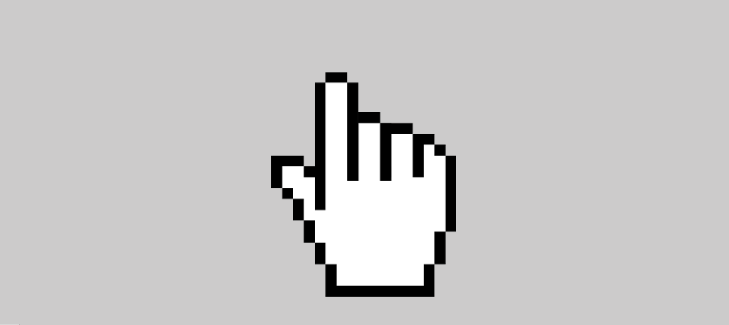
If you move your cursor down, the pointer finger goes up.
If you move your cursor up, the middle finger goes up.
Fun. Useless. And extremely popular (it gets thousands of visitors every month).
But what would happen if the fingers didn’t move?
Nobody would visit.
This might seem obvious, but trust us, there are plenty of websites out there that look brilliant but just don’t work when you use them.
People who end up on your website are looking for something.
Do they want to know how much your products cost?
Maybe they want to read more about your company?
Whatever the case, you have to make it as EASY as possible for them to find what they’re looking for.
This goes back to the principle that you absolutely do not want people to get frustrated with your site.
If people have to spot Waldo to find what they’re looking for, most of them will give up.
They’ll click the back button, annoyed.
And, as always, they might head over to your competitor instead.
That’s why a good navigation menu is super important.
Be careful not to stuff your navigation menu, though. If you can put each page in drop-down menus instead of the menu, that’d look neat.

Aside from that, you’ll also want your pages to interlink naturally to one another.
If you’re talking about your product on a page, link to it!
If you’re talking about information found in a blog post, link to it!
Not only will this help people find what they’re looking for, but it also has SEO benefits.
Get straight to the point.
Remember, nobody really cares about your company. They only care about what you can give them.
Don’t waste their time with how awesome your company is or how fancy your design is.
Get straight to the point.
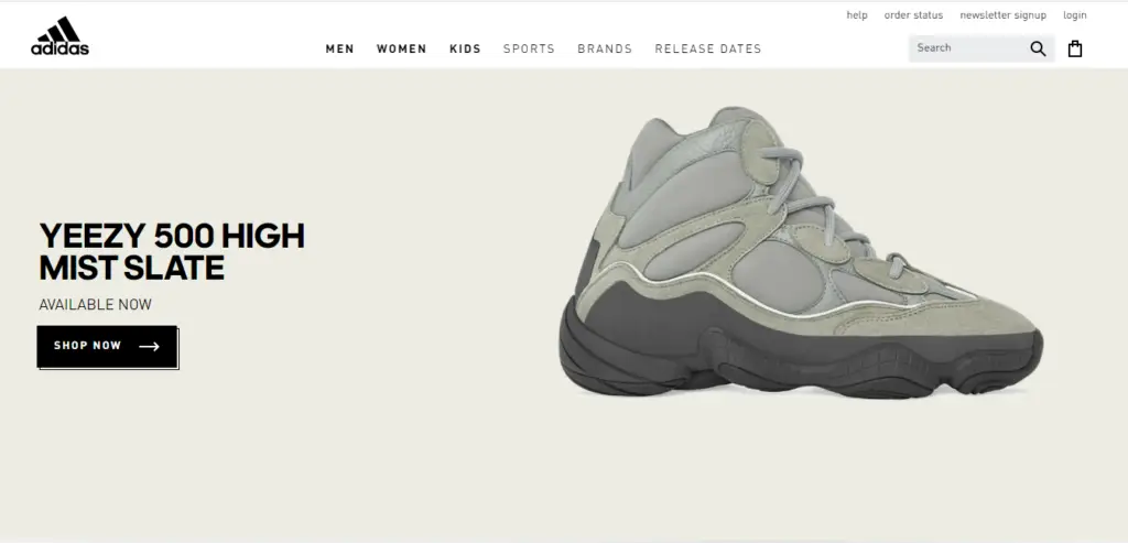
The simpler your website is, the better. Simple websites are often very easy to use, which is a huge part of good website design and user experience.
Look at how straightforward this Adidas home page is:
Also, simple websites are fast to load.
If you stuff your website with visuals and videos and pop-ups, it’ll take forever to load.
Good website design is about removing all inconveniences for your visitors. And slow-to-load pages are a big headache.
With a simple, usable, fast, and easy-to-navigate website, anyone that visits your site will have a splendid time.
Quick fact:
According to Statistica, 91% of internet users use mobile devices.
If your website design isn’t compatible with mobile, who knows how many people you’ll turn away?
Many people focus on the design of their website for desktop, which is not a bad thing.
But if you neglect what it looks like on mobile, it usually turns out terrible.
Not only will the design look like spilled paint, but it also won’t be usable or easy to navigate.
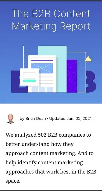
On the other hand, good web design looks splendid even on mobile. Just like the Backlinko blog:
So don’t forget mobile users!
Last but certainly not least, you’ll need attractive CTAs.
What’s that, you ask?
CTA = Call to Action.
It’s those bright and colorful “Buy Now” or “Subscribe” buttons you see on websites.
Having one of those on your website is essential.
No matter what your business is, you don’t want traffic on your website for traffic’s sake.
You want them to do something.
Whether that’s buying your product, signing up for your email list, or getting them to contact you, an attractive CTA will help convert your traffic.
And here’s a little tip:
Make your CTA stand out.
Make it big, easy to find, and make people’s eyes go to it the moment they arrive at your page.
You can do this in two ways:
Bright, contrasting CTAs grab your attention.
They’re like a giant exclamation point saying, LOOK HERE!
Take a look at this web page:

Which color stands out?
That’s right. It’s the orange.
This website is trying to get its visitors to do one of four things.
And since the buttons are big, bright, and outstanding, people will see them immediately.
And, if they’re interested, they’ll click on them right away – meaning that the website design did its job correctly.
The other type of CTA is known as white space.
Take a look at this page and ask yourself what you’d click:
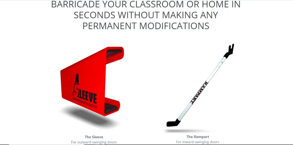
That’s right. You’d click on one of the images.
This design is known as white space. It’s a minimalist style that Apple is well known for.
Remember the Adidas website above? They use this style as well.
Instead of making a striking CTA button, you surround the button with nothingness.
That way, people’s eyes are naturally drawn to the subject.
You can use striking contrasts or white spaces, or you can use both for your website. Either way, make sure you draw attention to the buttons you want your visitors to click.
Don’t jam it down their throats, of course.
But make it simple, elegant, but outstanding.
With these design elements in place, your web design should be ready to rock!
We’ve already hinted at this from time to time.
But now we’ll give you the straight facts.
Good website design is a HUGE part of your online marketing efforts.
Why?
Because nobody likes a website that isn’t well designed.
Nobody likes a website that:
With good web design, people will not only get a good impression of your business, but they’ll also enjoy using your site.
And the longer they stay, the more this signals to Google that people find your site valuable.
This, in turn, will push your website up the rankings.
It’s one of the best ways to boost your SEO.
But get this:
Website design HELPS your online presence. It doesn’t do it by itself.
This means that you’ll still have to work on your SEO to succeed online.
Again, all web designers should know this (unfortunately, some only focus on the looks. Watch out for these people).
With all the tips and tricks we’ve given you, you should be ready to create an incredible web design.
So go for it!
But don’t stop there.
Because if there’s one thing you need to take away, it’s this:
Website design is only half the battle.
That’s right, focusing solely on web design is NOT enough.
You can have the most brilliant design in the world, but STILL, nobody will find your website.
Because what’s the point of finding the cure to cancer if you can’t share it with anyone?
You have a brilliant product, but no one will buy it if they don’t find it.
That’s why you have to get people to visit your website.
Again, good website design helps, but you’ll need so much more.
So grab our FREE website audit and find out how you can improve your website design AND your SEO to transform your website into an ultra-valuable asset.